Raster Data Plotting
Raster Data Plotting is a QGIS plugin for creating different plots visualizing raster data.
The Raster Data Plotting plugin adds a panel for creating i) 2-d scatter/density plots visualizing all visible pixel for two selected raster bands. The scatter plot data is adapting in real-time, whenever the map canvas extent changes. ii) spectral profile plots, and iii) temporal pixel profile plots (requires separate RasterTimeseriesManager plugin).
Getting started
- Installation:
- In QGIS select QGIS > Plugins > Manage and Install Plugins…, search for RasterDataPlotting and install the plugin.
- Start:
- In the toolbar click
 to show the Raster Data Plotting panel.
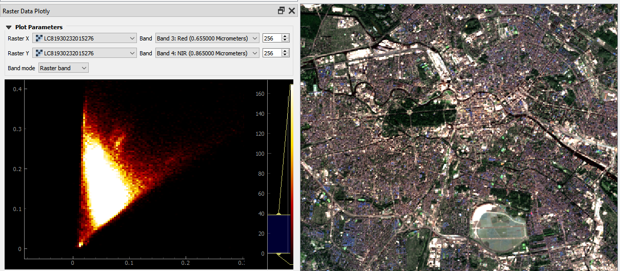
- Interactive 2D Scatter/Density Plots:
Select two raster bands (e.g. Red and NIR bands of a Landsat 8 image).
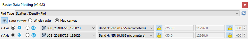
Zoom to full scene extent …
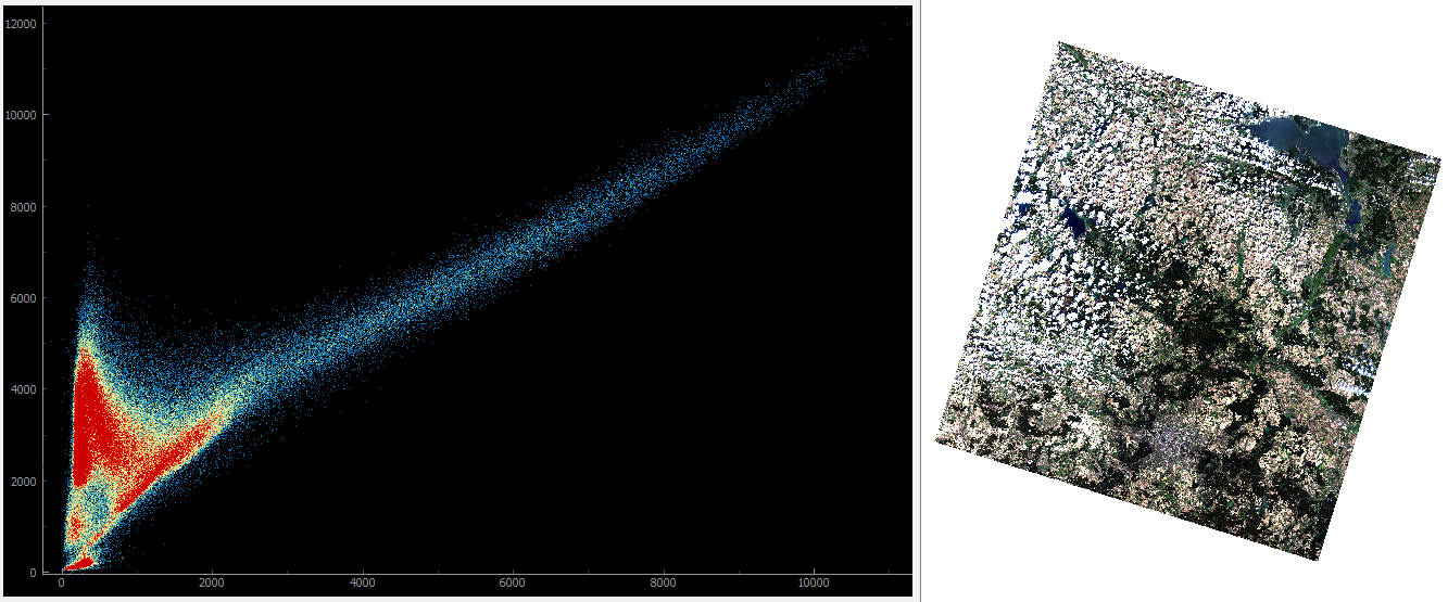
… and then zoom into an urban area.
Notice how the plot interactively updates with changing map canvas extents.
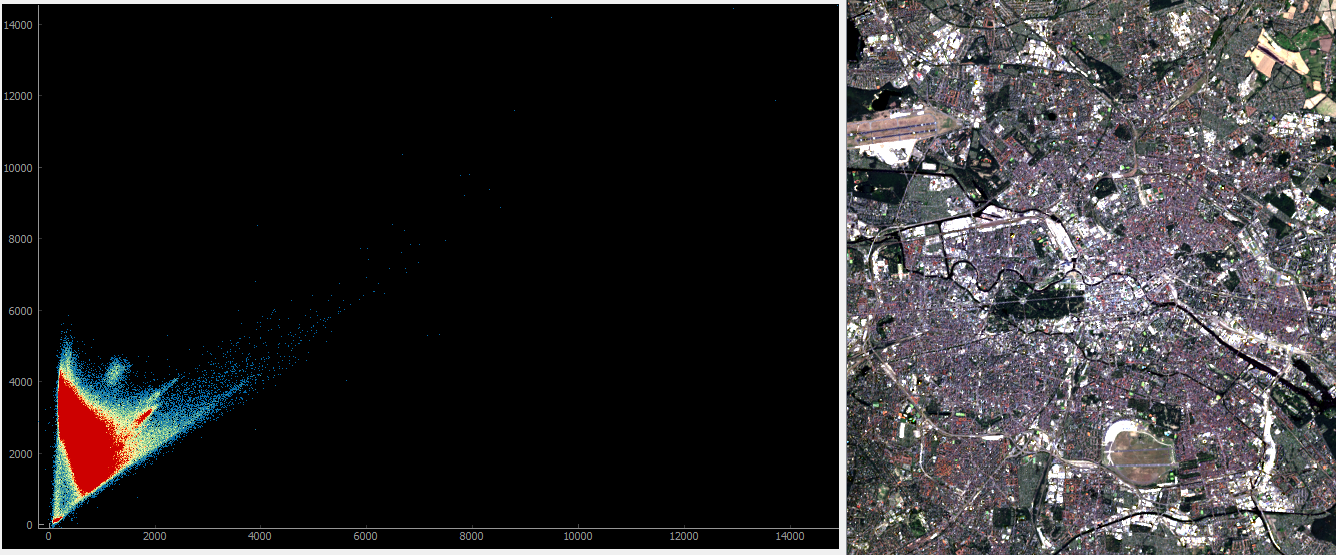
- Interactive plotting:
Zoom to the raster layer and navigate to specific locations of your choice. Notice how the plot is adopting to the map canvas content.
Agricultural area.
Urban area.
Scatter / Density Plot
The scatter plot is using Cartesian coordinates to display values for two raster bands. Data density is derived by 2-d histogram binning. The number of points falling onto the same bin are color-coded.
Spectral region of interests
Create spectral region of interests (spectral ROI) inside the scatter plot to overlay/colorize pixels in the map canvas with the same spectral characteristics.
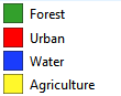
E.g., in this Landsat 8 image, it is quite easy to identify Water and Forest pixels inside a Red vs. NIR scatter plot:
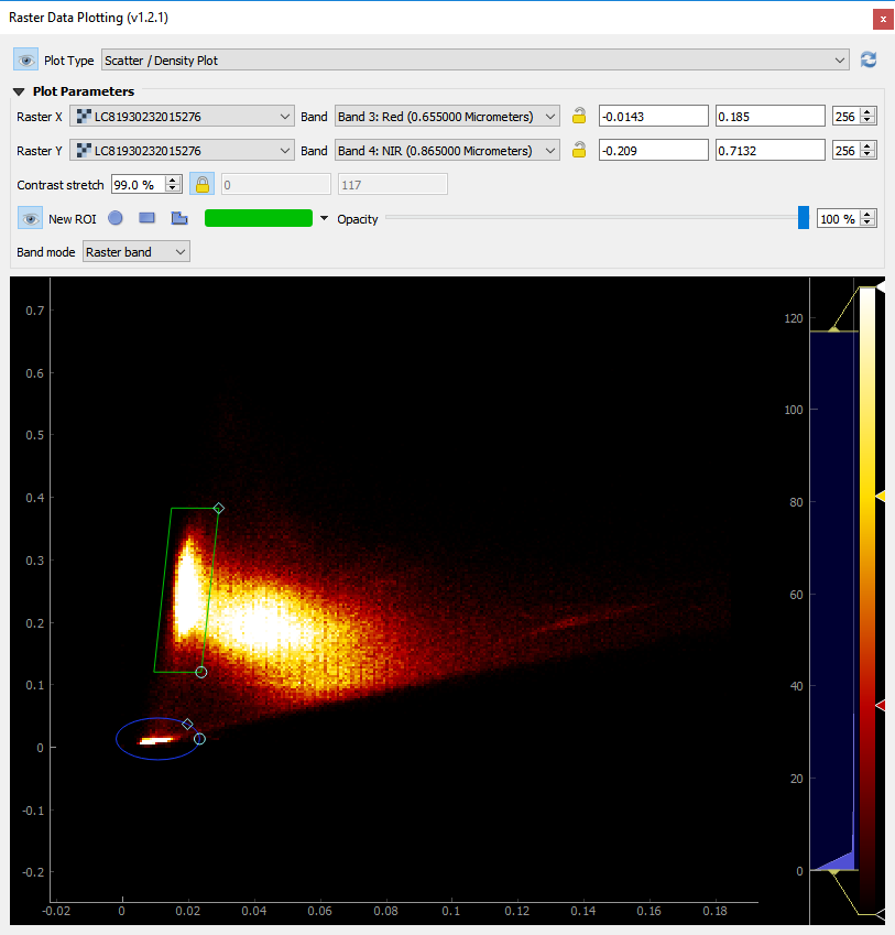
Scatter Plot: Landsat 8 Red vs. NIR with two regions capturing Water and Forest pixels.
Map Canvas: Landsat 8 in true-color composition (left) and together with spectral ROIs overlay (right).
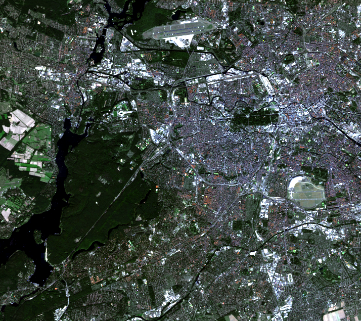
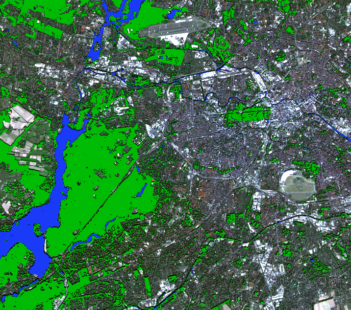
Spatial region of interests
Select spatial region of interests (spatial ROI) to focus the analysis on specific regions in the map canvas (e.g. urban, forest, water or agriculture areas).
Given a Landsat 8 image and some landcover polygons, different kinds of plots are available.
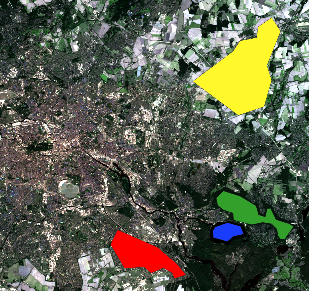
MapCanvas: Landsat 8 in true- color composition and four different landcover polygons as spatial ROISs.

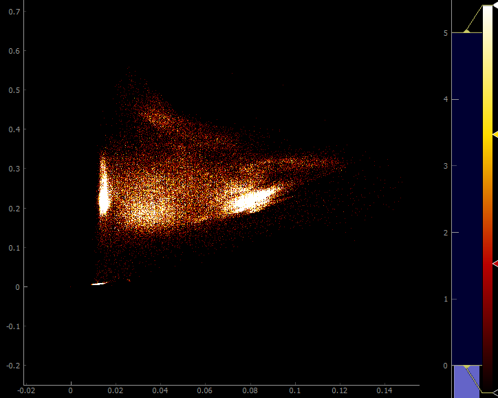

Scatter Plots: density of all pixels (left), density for spatial ROIs (middle), and colorized scatter for spatial ROIs (right).
Note that for coarser binnings, it is very likely that points from different ROIs will fall into the same bin. In those cases, the bin color is given by a weighted average of the involved ROI colors.
Animated plotting
Create an animated scatter plots by choosing raster bands of a timeseries that is manages by the Raster Timeseries Manager plugin.
Example of an animated scatter plot with Tasseled Cap Brightness vs. Greenness.
Spectral Profile Plot
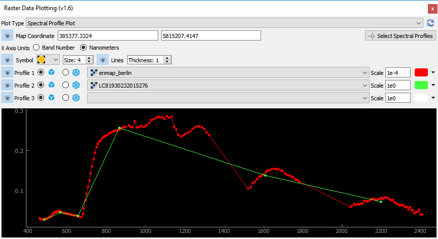
Spectral Profile Plot: multi-spectral Landsat 8 and hyperspectral HyMap profiles for the same map location.
Temporal Plot
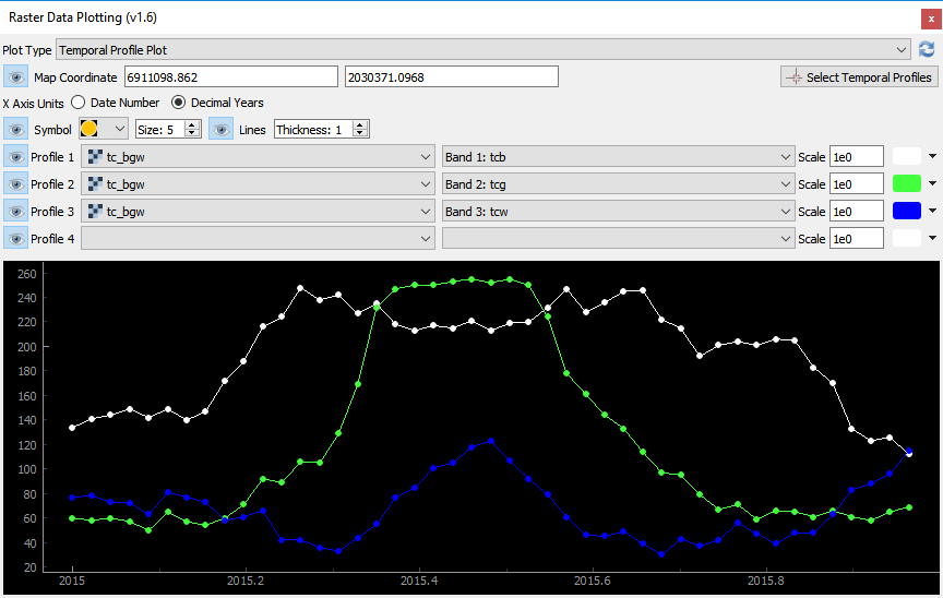
Temporal Profile Plot: Landsat timeseries temporal profiles for Tasseled Cap Brightness (white), Greenness (green) and Wetness (blue) for the same map location.
Plugin Dependency
For Temporal Profile Plots install the RasterTimeseriesManager plugin.
Contact
Please provide feedback to Andreas Rabe (andreas.rabe@geo.hu-berlin.de) or create an issue.